Why Neutrality is the Architectural Confession of National Fatigue
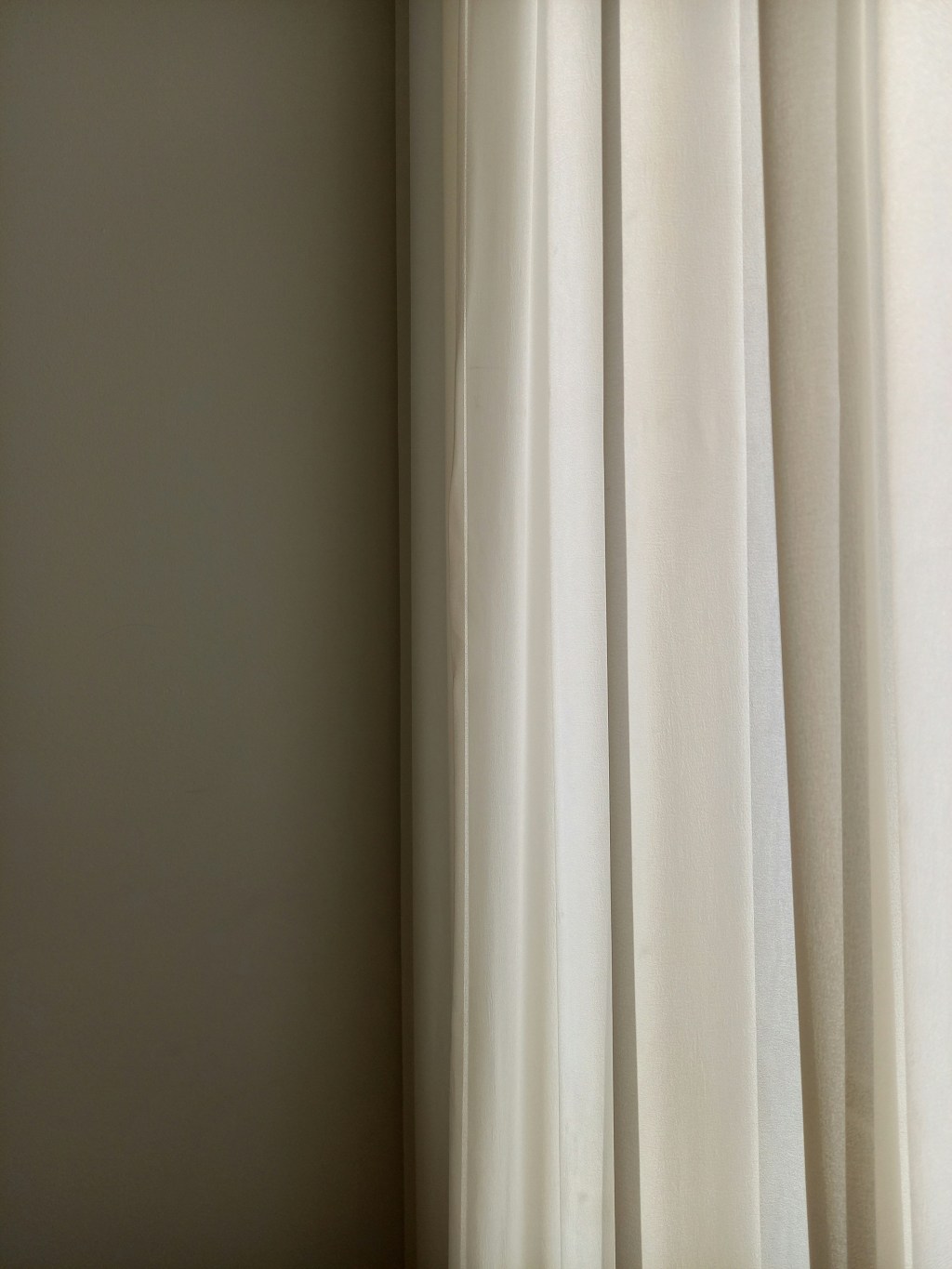
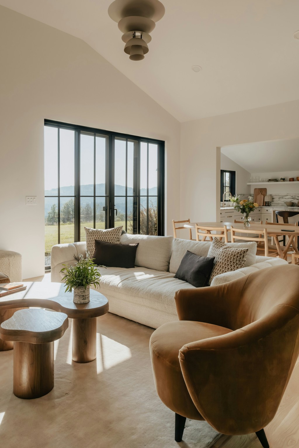
Observe the aspirational modern interior. It is quiet. It is texture-heavy, yet visually barren. It is aggressively, meticulously, neutral. From London apartments to Cheshire new builds, the grey, taupe, and beige palette – often given absurd, evocative names like “Elephant’s Breath” or “Skimmed Milk” – is not a design choice; it is an architectural resignation.
Neutrality is not, as its proponents claim, soothing. It is the colour of surrender. It represents a collective decision to reject opinion, risk, and joy, in favour of a silent, sophisticated void that demands nothing.
The Fear of Being Wrong
Why this obsession with the colourness? Because in a world of accelerating social critique and algorithmic judgment, colour is risk. To choose a bold blue or a challenging ochre is to commit to a decisive taste – and thus, open oneself up to the horrifying possibility of being deemed wrong by the zeitgeist.
The neutral palette is a foolproof investment. It guarantees resale value, survives every passing trend, and accommodates any temporary, colourful accessory (a pillow, a vase) that can be instantly swapped when the whim passes. This is the architecture of emotional non-commitment. The neutral room is designed for the person who wants to be ready to leave, to sell, or ready to pivot their entire aesthetic at a moment’s notice. It is the aesthetic of perpetual contingency.
The Tyranny of the Un-Opinionated Background
This resignation aligns perfectly with the political landscape of the last decade. The austerity years of the 2010s mandated a tightening of the belt, and our interiors followed suit, stripping themselves of loud individualism. We chose minimalism for the poor – the cheapened, accessible version of a style originally designed for monks and billionaires.
The beige room tells the visitor: I am sensible. I am stable. I am un-opinionated. It is the interior design equivalent of hedging your bets. It is not the room of an artist, or a thinker; it is the room of a financial professional who values flexibility and predictability above all else.
The Digital Canvas
Most cynically, the neutral palette serves one master above all others: the camera.
In the age of social media and constant remote work, the home must perform. The neutral wall, free of distracting patterns or colours that distort light, is the perfect, calibrated backdrop for the digital self. It guarantees flawless lighting for Zoom calls and makes the star of any Instagram photo – the homeowner – pop.
The room sacrifices its own identity to become a seamless, expensive canvas for the performance of the occupant. We are, in effect, painting our houses the colour of a clean, cropped image file. The architecture exists not to house a life, but to photograph a life.
To live in a sea of beige is to choose a life that refuses to speak. It is the final, sad confession that we are simply too tired – too anxious from work, too overwhelmed by global news, too paralysed by social risk – to have an interior life that demands to be seen. The beige room is a beautiful, expensive tomb designed for those who have emotionally checked out.
JG x
Galatea Studio designs spaces that are rooted in intellectual honesty, not aesthetic denial. If you are ready to create an environment that reflects how you actually live – rather than how you aspire to be perceived – we invite you to view our portfolio or inquire about your next project in Manchester and Cheshire.


Leave a comment